Scottish Power — App Accessibility Project

Background
When I joined the Scottish Power app, accessibility had not yet been embedded at a systemic level. Screen reader behaviour across iOS and Android was inconsistent, colour contrast did not reliably meet WCAG standards, and component patterns varied between platforms without shared documentation or governance. Accessibility considerations were handled reactively rather than as part of a defined product strategy, and there was no clear framework guiding teams toward accessible-by-default delivery.
Challenge
Define and implement an accessibility strategy for the mobile experience by rebuilding the iOS and Android design systems to align with WCAG 2.2, then demonstrate measurable impact by redesigning a high-traffic core journey. This needed to be achieved within existing delivery constraints, without dedicated research resource, and while bringing cross-functional teams along on a new standard of working.
Impact
Rebuilt the full iOS and Android design system component by component
with accessibility baked in from the start
Every component documented
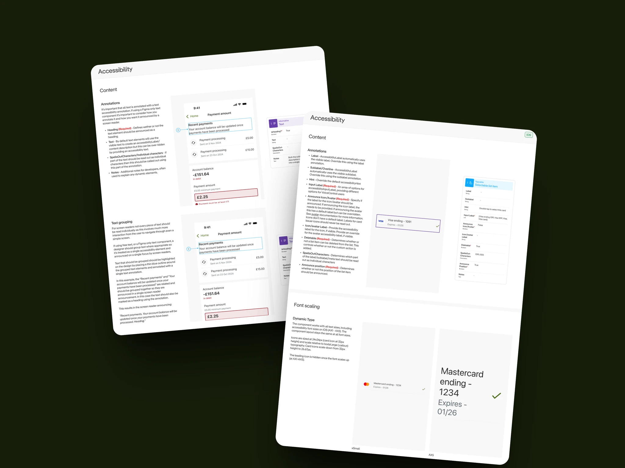
full screen reader behaviour, dynamic type support, colour modes, focus states, developer handoff
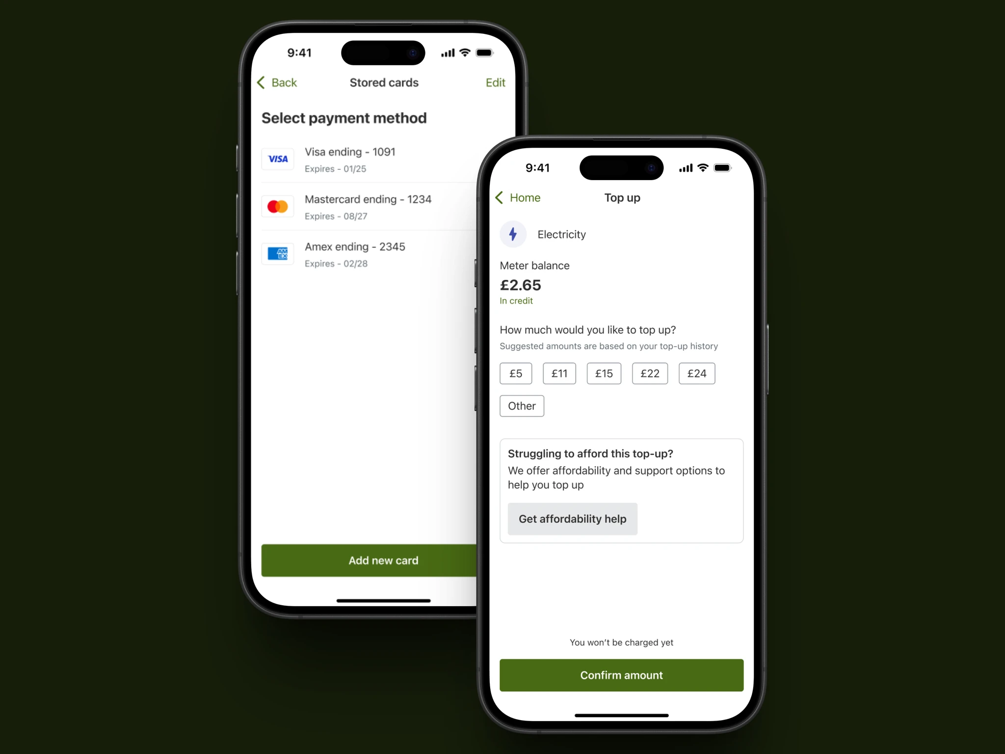
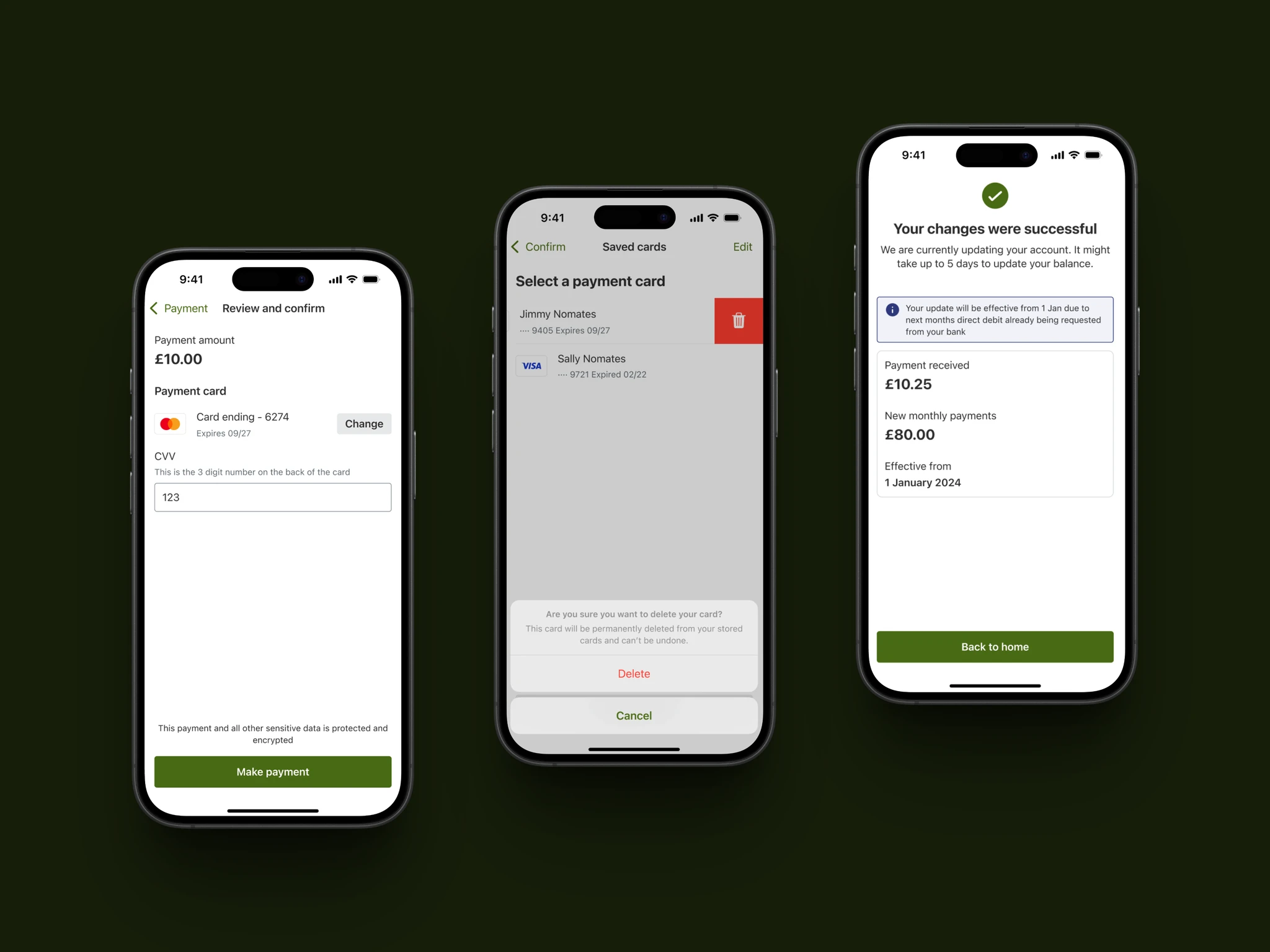
Card payments journey redesigned end to end
validated through usability testing as the proof of concept
Accessibility annotations standardised
one element, one annotation, shared across iOS and Android
Design system and patterns shared with the wider team
creating a shared source of truth where none had existed
My role
Senior Product Designer — accessibility strategy, design system rebuild, component documentation, journey redesign, and developer handoff
Team
Scottish Power product and engineering teams, working within existing delivery squads
Company
Scottish Power
Timeline
May 2024 – May 2025
Platform
iOS & Android — Scottish Power mobile app
The Problem
The Scottish Power app served millions of customers managing something essential to their daily lives. But for customers relying on screen readers, keyboard navigation, or dynamic type, the experience was inconsistent and often difficult to use.
An early audit revealed that screen reader journeys across iOS and Android were unreliable, key elements such as focus states and semantic labels were missing, and colour contrast did not consistently meet WCAG standards. Over time, iOS, Android, and web had evolved separately, each developing its own components and patterns without shared documentation or governance. What emerged was not one coherent system, but several parallel ones.
The challenge was not a lack of intent. Teams cared deeply about the product and the people using it. The gap existed because accessibility had never been embedded into the foundation of how the product was designed and delivered. It had no clear ownership, no defined standards, and no place in the workflow. My role was to change that.
My Role
I led the accessibility work alongside a Scottish Power product designer, helping define and implement a more robust accessibility standard for the mobile app.
With no existing roadmap in place, we established the approach while I focused on the audit, design system updates, and implementation framework. I conducted a full accessibility audit across iOS and Android, rebuilt components within the design system, developed an accessibility annotation model for developer handoff, and redesigned the card payments journey as a proof of concept.
I also supported internal usability testing and contributed to documentation and knowledge sharing across design and engineering.
The Approach
Start with clarity
Before redesigning anything, we needed a clear understanding of the current state. I conducted a structured accessibility audit across iOS and Android, reviewing the app against WCAG standards and platform guidelines. I also reviewed analytics to identify high-traffic journeys and spoke with stakeholders to understand technical constraints and historical decisions.
The audit highlighted recurring themes: unreliable screen reader behaviour, inconsistent components across platforms, limited documentation, accessibility gaps within the workflow, and no shared ownership model.
This established a clear baseline and informed the direction of the work.
Strengthen the foundations
Rather than addressing issues in isolation, we focused on improving the underlying system.
I rebuilt components within the design system with accessibility defined at the component level. Colour contrast ratios were recalculated. Focus states were standardised. Dynamic type behaviour was specified. Screen reader semantics were documented and annotated. Each component included implementation guidance to support engineering alignment.
The objective was consistency across iOS and Android and a system that could scale.
Apply it to a real journey
To validate the approach, we applied the updated components to a high-traffic journey: card payments.
This allowed us to test the system within a live, end-to-end experience. I conducted accessibility testing on the redesigned journey using screen readers and dynamic type settings to assess behaviour across devices. We also ran internal usability sessions to identify friction points and refine the flow.
Testing the journey in context helped demonstrate how accessible patterns could function within a production environment.
Embed it into practice
Sustainability was critical.
I formalised an accessibility annotation framework to support developer handoff and contributed to documentation so that designers and engineers had a shared reference point. The aim was to establish a clearer process and reduce ambiguity in how accessibility should be considered across future work.
Accessibility became more visible, structured, and integrated into day-to-day delivery.
The Outcome
A fully rebuilt iOS and Android design system with accessibility standards embedded at component level, a redesigned card payments journey as the first fully accessible high-traffic flow, and an annotation framework that gave engineers everything they needed to implement correctly. For the first time, the team had a shared foundation and a clear process for how accessibility gets designed, documented, and built.
Reflection
This project reinforced the importance of embedding accessibility at system level rather than addressing it at feature level. By focusing on components, documentation, and workflow, the impact extended beyond a single journey and supported longer-term improvements in how the product evolves.
Want to know more about this project?
Learn more