
Background
Mastercard's Send platform, used by global financial institutions and transaction partners to manage payment transfers, had an onboarding flow and transaction management interface that couldn't scale. Complex, data-heavy flows with inconsistent UI patterns were slowing adoption as the platform expanded globally.
Challenge
Redesign the platform UI to simplify onboarding for financial institutions and make transaction management legible at scale, within Mastercard's design system and a tight delivery timeline.
Impact
Scalable UI covering institution onboarding, payment configuration, and transaction management
delivered end-to-end within timeline
Progressive disclosure reduced cognitive load
across complex multi-step flows
Extended Mastercard's design system with new data visualisation patterns
adopted across the platform
Built to support multiple financial institution types globally
from a single design framework
My role
Product Designer — solo designer across UX and UI design, design system extension, and developer handoff
Team
Mastercard business analysts, engineers, and stakeholders
Company
Mastercard via BJSS
Timeline
November 2021 – August 2022
Platform
Web — enterprise dashboard
The Problem
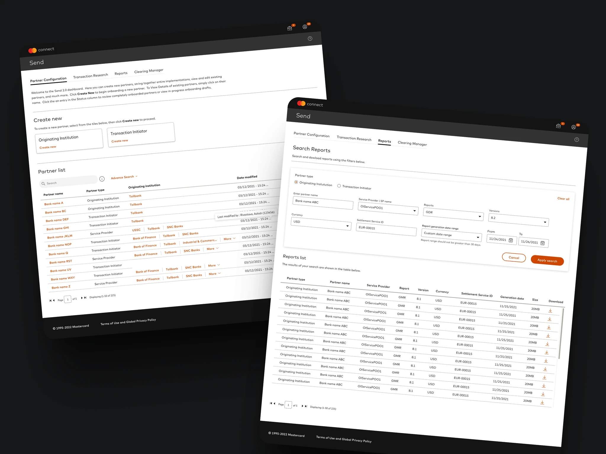
Mastercard's Send platform, used by global financial institutions and approved transaction partners to manage payment transfers, had an onboarding flow and transaction management interface that couldn't scale. Setting up institution profiles, configuring payment preferences, and processing transactions required navigating complex, data-heavy flows with no clear hierarchy and inconsistent UI patterns.
As the platform expanded to new financial institutions globally, the design debt was becoming a business problem.
My Role
I was brought in as the lead designer on the UI redesign of the Send 2.0 platform. Working directly with Mastercard's business analysts and stakeholders in weekly sprint sessions, I owned the design process end to end — from mapping existing flows and identifying failure points through to delivering a scalable, production-ready UI aligned to Mastercard's design system.
This was primarily a UI and systems project rather than a research-heavy engagement. The complexity was in the data: making dense, multi-variable transaction information legible and actionable for financial institution users, and designing at a scale that worked across multiple institution types globally.
The Approach
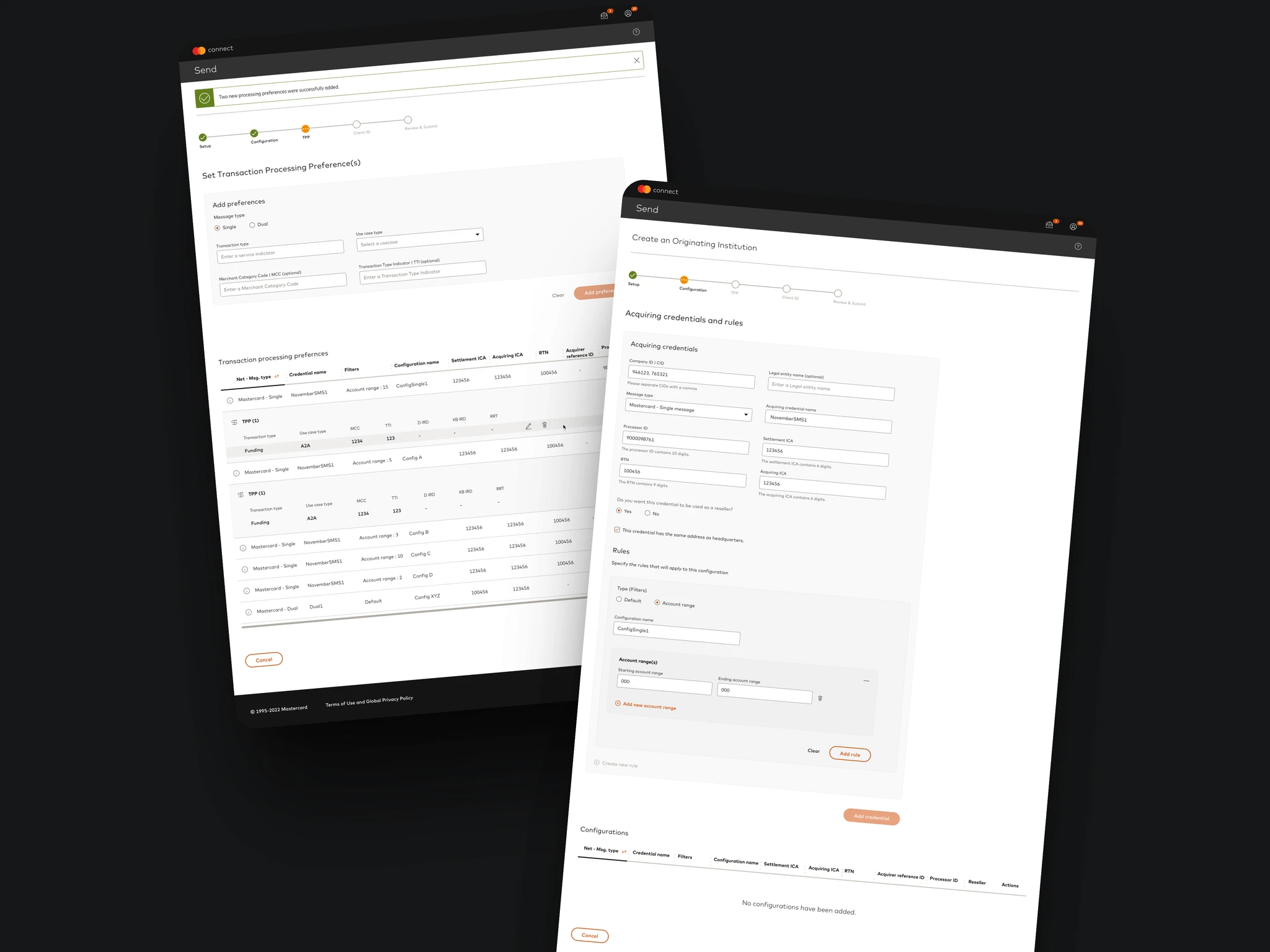
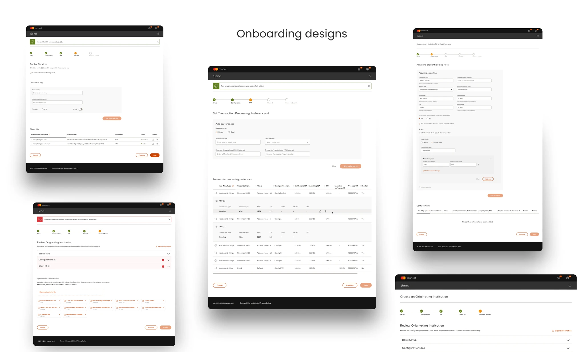
Mapped the complexity before designing anything. I worked through Mastercard's documentation and ran sessions with business analysts to understand the exact flows — including onboarding for Originating Institutions, configuration for Transaction Initiators, and transaction processing preferences. Understanding the business logic was a prerequisite to designing the UI.
Simplified without losing functionality. The temptation on data-heavy enterprise platforms is to surface everything. I pushed for progressive disclosure — showing users what they needed at each stage of a flow, not everything at once. This reduced cognitive load without removing functionality.
Built within Mastercard's design system, but pushed it where needed. The existing design system gave us a strong foundation for typography, colour, and components. Where it didn't cover complex data visualisation needs — including charts, multi-state tables, and bulk transaction views — I created additional patterns that extended the system without breaking it.
Tested direction through A/B comparisons in sprint reviews. Rather than presenting one solution, I brought two or three directional options to weekly reviews with stakeholders and analysts. This created genuine dialogue and sped up decision-making because conversations were concrete, not abstract.
The Outcome
A scalable UI for the Send 2.0 platform that simplified onboarding for financial institutions and made transaction management legible at scale. The design covered institution profile setup, payment configuration, and transaction processing — built to work across multiple institution types globally and aligned to Mastercard's design system throughout.
What I'd Do Differently
More direct user access. The nature of this engagement meant I was designing primarily from business analyst feedback and documentation rather than from direct sessions with the financial institution users themselves. The designs were functional and well-received internally, but I'd push harder for even one round of testing with actual platform users. The edge cases you miss without direct access are always the ones that matter most in enterprise products.
Want to know more about this project?
Learn more